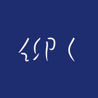
About the new logo "BO"
Atsushi Ichino
If there is an image that comes to mind when you hear the words "typical sneakers," for me it is the blue oversized Mikey, but I don't think that's because I had an image of typical sneakers in mind to begin with; rather, I think it was a new sensation that I first perceived when the Mikey came out.
Typical. Or to use more design-related terms, something anonymous. While there is a sense of security and elegance there, I don't think there is much of a sense of "newness." But Mikey's appearance is as if it has been like this since ancient times, and it still embodies the concept of "New Unchanged." And this "nonchalant" feeling was very appealing.
It seems like a big responsibility for Blue Over to create a new logo, and it is, but the initial order from Watari, the company's president, was more of a light-hearted request, like they were making caps and T-shirts and asked me to create a nice logo to print on them, but I'm not sure if I would have gotten in trouble for saying that.
First, in order to explore the shapes that can only be created by moving my hands, I set the concept aside for the moment and simply played with the shapes of the letters, searching for points that would be interesting from a sculptural perspective. I wanted to incorporate the atmosphere of blue over into just two letters, "B" and "O."
Watari was also wavering. It seemed as if he was reexamining from scratch what kind of brand and organization Blue Over was. He wanted the concept to be expressed more conceptually. Perhaps the letter "BO" element wasn't even necessary. He was also asked to go for a more Japanese image, like a family crest, and so on. After numerous meetings, there were times when neither of them knew the answer.
After taking many detours, we ultimately returned to the simplest initial idea. It was a journey that was absolutely necessary in order to think about what kind of brand we wanted to be. Welcome back, BO. And congratulations. Looking ahead to the next 10 years, you seem to be a little proud and exuding a sense of freshness, perhaps because you're a doting parent.


Atsushi Ichino
designer.
Based in Kyoto and Tokyo, he works on client projects, primarily graphic design. His diverse activities also include creating works based on chance and rules, being a member of the theatre group "Ungetzifa", "POETNIK", a group that creates poetry and objects using poetry as a medium, and the design project "rabbit hole".


